SyngHub Multi-Purpose Hero Banner
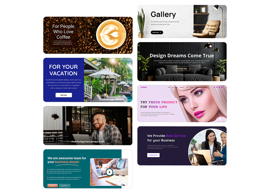
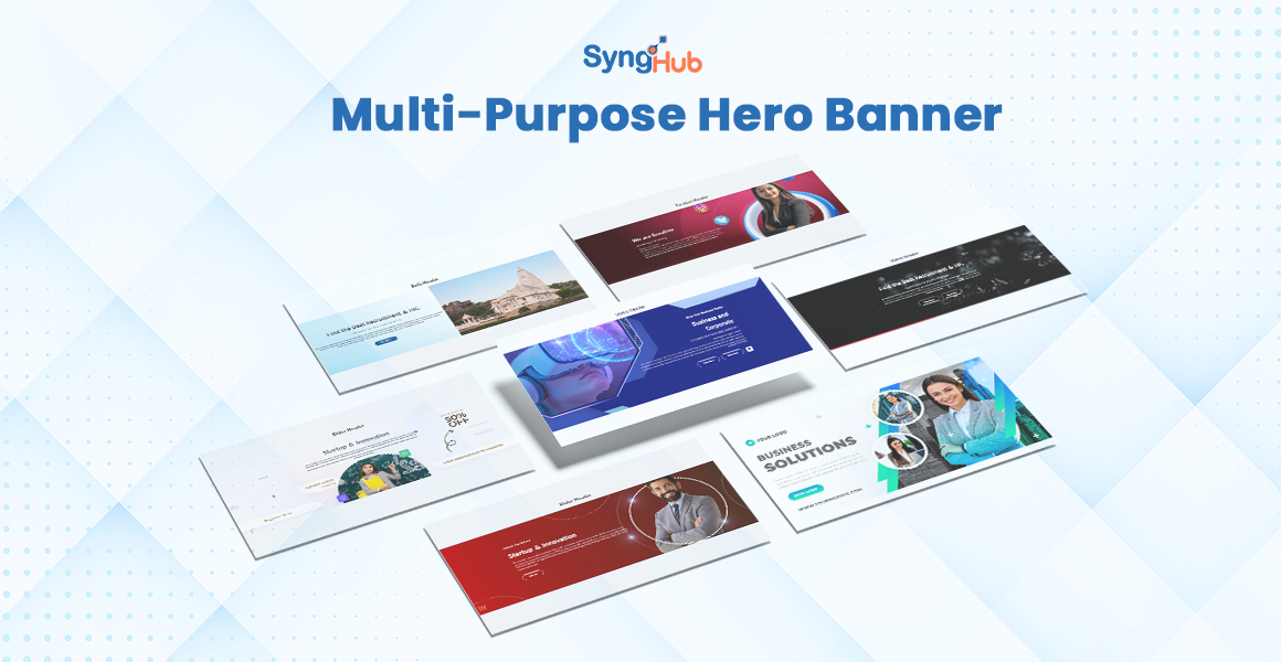
The SyngHub Multi-Purpose Hero Banner is a flexible HubSpot module designed to create high-impact hero sections across any website. It offers five powerful layout variations Static, Parallax, Video, Slider, and Split—allowing marketers and developers to visually tailor the hero experience based on content and campaign needs.

Overview
→Overview
The SyngHub Multi-Purpose Hero Banner is a flexible HubSpot module designed to create high-impact hero sections across any website. It offers five powerful layout variations—Static, Parallax, Video, Slider, and Split—allowing marketers and developers to visually tailor the hero experience based on content and campaign needs.
Each variation is fully customizable, responsive, and optimized for performance, making it easy to build engaging first impressions without additional development effort.
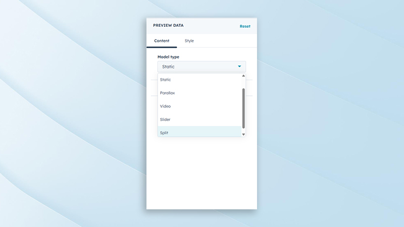
Background Variation Types
Supports multiple background formats including static image, parallax, video, slider, and split layouts. This allows the hero section to adapt to different content strategies and visual storytelling needs. Each variation is designed to maintain performance and visual consistency.
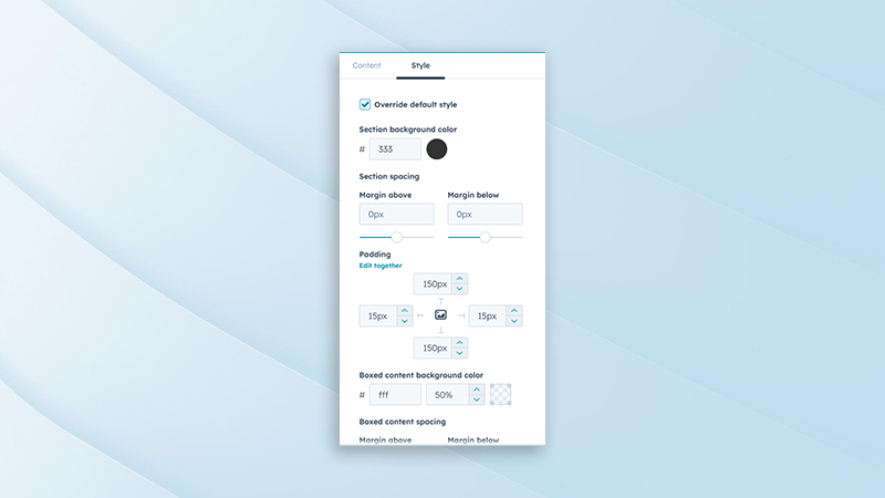
Background Styling Options
Provides styling controls such as overlay colors, opacity, gradients, and background positioning. These options help enhance readability and ensure brand consistency across different background types. Styling adjustments can be made without custom CSS.
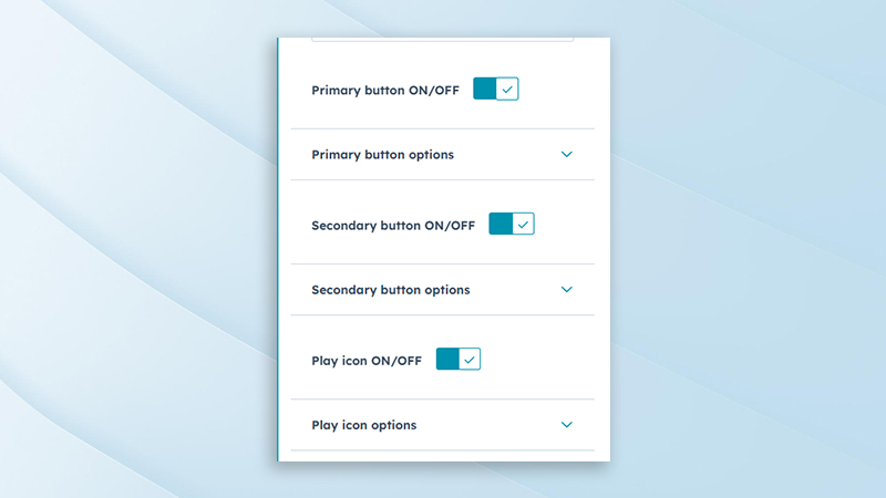
Button Toggle Controls
Allows primary and secondary buttons to be enabled or disabled individually. This gives flexibility to display single, dual, or no call-to-action buttons based on campaign requirements. Helps maintain a clean layout when CTAs are not needed.
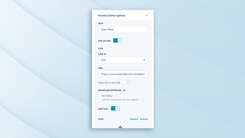
Primary Button Content Settings
Enables editing of primary button text, link URL, target behavior, and accessibility labels. This ensures clear and effective call-to-action messaging. Suitable for lead generation, navigation, or conversions.
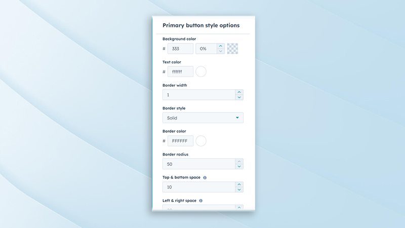
Primary Button Styling Options
Includes customization for button color, hover state, size, border, and typography. These controls help align the primary CTA with brand guidelines. Visual emphasis can be adjusted to drive user attention.
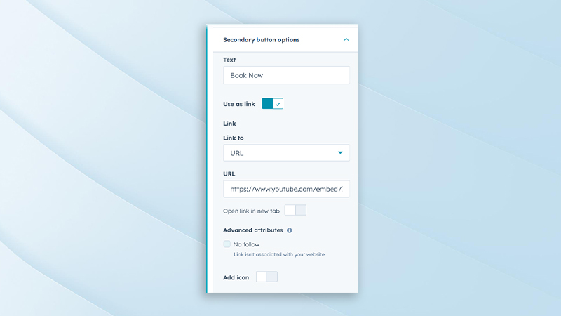
Secondary Button Content Settings
Allows customization of secondary button text, links, and interaction behavior. This is ideal for supporting actions such as “Learn More” or “View Details.” Keeps secondary CTAs visually balanced with the primary button.
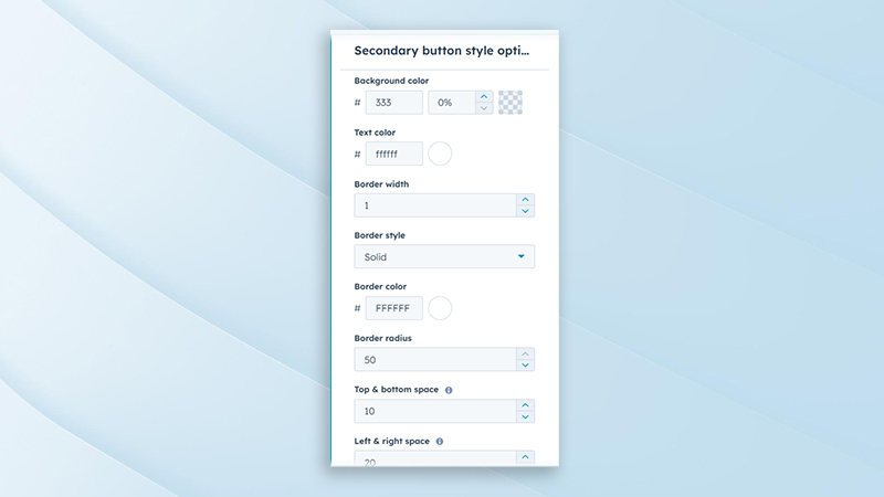
Secondary Button Styling Options
Provides styling options such as outline styles, colors, spacing, and hover effects. Helps differentiate the secondary button from the primary CTA while maintaining visual harmony. Fully customizable without additional code.
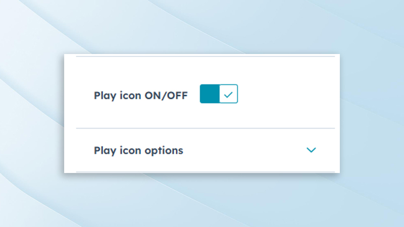
Play Button Visibility Control
Includes an option to enable or disable the play button for video-based hero variations. This ensures flexibility when using autoplay videos or static previews. Helps keep the interface clean and user-focused.
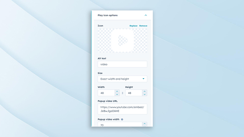
Play Button Customization Options
Allows editing of play button icon style, size, color, and position. These options ensure the play button integrates seamlessly with the overall hero design. Enhances user interaction and video engagement.
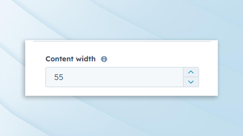
Content Width Control
Provides adjustable content width settings to control text container size. This helps improve readability and visual balance across different screen sizes. Suitable for both full-width and constrained layouts.
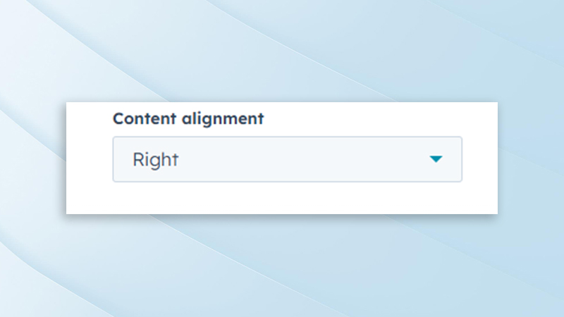
Content Alignment Options
Supports left, center, and right alignment for hero content. This allows flexibility in layout composition depending on design requirements. Ensures consistent alignment across all hero variations.
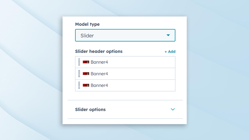
Slider Content Management
Allows individual slide content to be edited, including headings, descriptions, images, and buttons. Each slide can be customized independently for targeted messaging. Ideal for showcasing multiple campaigns or highlights.
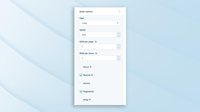
Slider Behavior Settings
Includes controls for autoplay, transition speed, navigation arrows, pagination, and loop behavior. These options ensure smooth and engaging slide transitions. Optimized for both performance and usability.
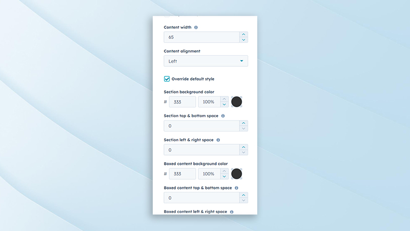
Slider Styling Options
Provides customization for slide spacing, overlays, navigation styles, and animations. Helps maintain brand consistency across slider layouts. All styling options are responsive and easy to manage.
Expert Assistance
Get direct support from our experienced support team
Online User Guide
Easy-to-follow documentation for smooth implementation
SyngHub Multi-Purpose Hero Banner
Partner with Syngrid’s HubSpot experts to unlock the full potential of your CRM, marketing, sales, and service automation. Whether you’re just starting or scaling your operations, we’ll help you drive growth, streamline processes, and maximise ROI.
